Getting Started - Edit Dilaog
If you would prefer to listen to a 15-minute video, try the button nav to the right.
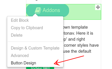
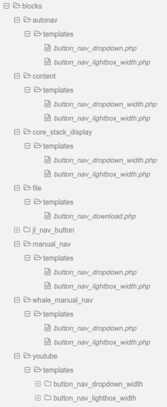
The edit dialog for Button Nav templates is accesed by an option added to the block edit menu. To use Button Nav with an autonav or other supported block or stack:
- Add the block or stack to your page or global area as you normally would
- Select the Button Nav Dropdown block template
- The popup edit menu will now show an additional option for Button Design
- This opens a dialog to input and associates a button design with the block or stack.
- On some core versions, you may need to save the block, publish, then return to Button Design menu to see all options.
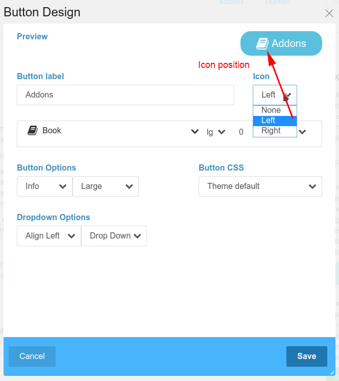
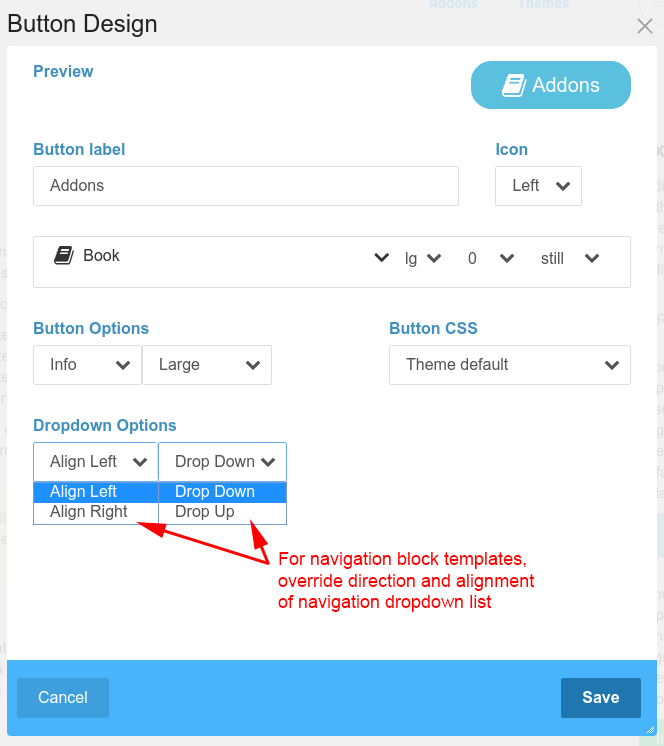
Preview
As you create the button, the preview area will update to show what the button will look like. If you have previously created any buttons, clicking on the preview button will open a pick-list of previous button designs. Click on any of these previous buttons and their settings will be copied into the button you are editing.
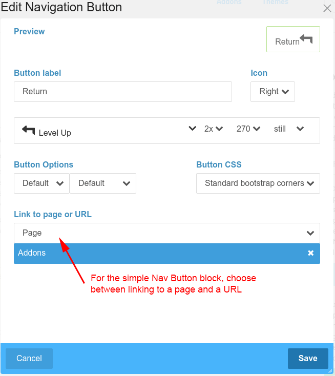
Button Label
The text that appears on the button. Leave empty for none. A button must have an icon and/or label.
Icon [position]
Select where the icon will be shown. Can be none, left or right.
Icon
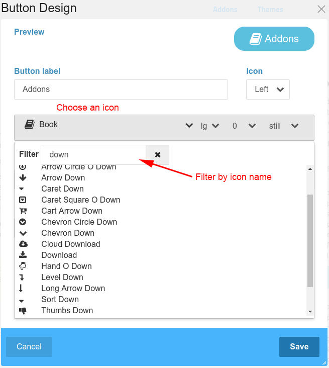
Select any FontAwesome icon. To help find the icon you want, enter text in the filter input to filter the icons shown. A button must have an icon and/or label.
Icon [modifiers]
Further dropdowns in the icon select allow icon size, rotation, flip and animation to be selected.
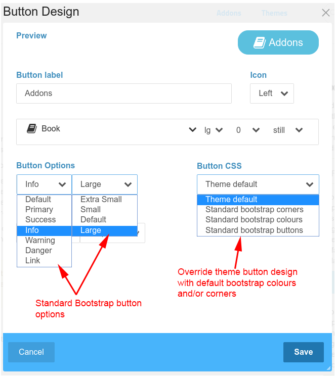
Button Options and CSS
Select between the usual bootstrap button options for function/colour and size. By default, Button Nav will use button styling from your bootstrap based theme. For example, Elemental adds extra rounding and padding to buttons and modifies the colours slightly. If you prefer to shift the button's CSS back towards the bootstrap defaults for corners and/or colours, you can select additional styling under Button CSS.
The LESS source files for these are included in the package if you want to develop your own modifications.
Optional Background Image
An image can be selected from the Concrete CMS file manager and used as a background for a button. Take care to prepare your images at an appropriate sizes for the actual buttons you are using them with before you use this option.
Optional Text Colour
Button text and icon colour is normally governed by the button options. However, sometimes the default colours just won't work. In particular, you may want to choose a different colour to go with an image background.
Button Placement and Offset
By default, buttons are placed inline. Button placement allows buttons to be relocated to a fixed position at any edge of the browser window, to the top, bottom or either side. The buttons are rotated to align with the edge and placement of the buttons can be further adjusted as a percentage distance along the edge. These are fixed with the browser window, so will remain in place as the document is scrolled. Great for adding extra navigation without interrupting the document flow or taking up valuable header space.
Optional Z-Index Adjustment
When you have multiple buttons close together, you may want to tweak the z-index so they don't interfere.
Dropdown Behaviour
For autonav and other navigation menu blocks, a further group of options allows the alignment and direction of the dropdown to be set.
Content Width
For navigation dropdowns, the width of the dropdown is governed by the actual navigation list. For other dropdowns and lightboxes, such as for the core content block or stack display, you can select a width for the content using any of the usual css units such as pixels, percentage, viewport width etc.
Optional Background Colour
Dropdown and lightbox background colour is normally governed by the theme. However, sometimes the default colours don't have enough pop. You can add whatever colour you like as a dropdown background and even set opacity so that what is beneath can show through.
Optional Overlay Colour
For lightbox templates, you can override the default lightbox overlay colour.
Link to Page or URL
For the Nav Button block, a further choice is to link the button to a site page or URL.
Quick select from previous designs
Clicking on the actual button preview will present a selection of previous button designs. You can then click on any of these and the current button will be set to match that design.
It is only the visible button design that is copied, not any button behaviour. Hence selections for popup direction and alignment of menus, or links associated with the Button Nav block, are not copied with the button design. To fully copy a button and all its behaviours, use the Concrete CMS block copy/paste.


Additional Pages
Current Templates
