Developing Tab Templates
Custom Templates
Magic Tabs comes with many example tab templates for traditional horizontal tab bars and for left and right vertical tabs. All of these also adapt for accordions. For many sites, one of these will fit in with the site theme with no further modification.
Some of these templates use existing concrete5 core styles in whole or in part, while others use theme styles or are completely self contained.
Custom templates contain two parts, a view.php and a view.css. You need to create both of these files in a new template folder:
- application/blocks/jl_magic_tabs/templates/your_template_name
This follows the same principles as any other block template, as described in Creating Additional Custom View Templates.
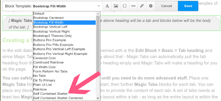
You can start from scratch, or copy and modify the default view for magic tabs or any existing template supplied with the package. A good starting point for a completely custom set of tabs is one of the Self contained starter templates for regular tabs or left or right vertical tabs.
Self Contained Starter Templates
These templates are wholly self contained, not relying on any theme CSS. They provide all the styles necessary for tabs and accordions. If all you want is a custom colour scheme for your tabs and their borders, these templates are easy to modify with your custom colour scheme.
- Copy the template to application/blocks/jl_magic_tabs/templates/your_template_name.
- Make a global edit in the css and php to replace the class that identifies the template, such as jl_magic_tabs_self_contained_starter with your_template_name.
- Find the colours you want to change and make a global edit on them in the css.
The starter templates are:
- Self contained starter
- Self contained starter pills
- Vertical left starter
- Vertical right starter
Don't feel you are limited to starting from these templates. If you have a bootstrap based theme, many of the other templates can also be easily modified.
Template naming conventions
If your template requires core assets, Magic Tabs can load those assets based on a naming convention for the template. As long as your template name includers the relevant substring, Magic Tabs will ensure the required asset is loaded. Assets supported are:
- core/app css : "_ccm" or"ccm_"
- (deprecated) jquery/ui css :"_ui" or "ui_"
- btnPro/button-css css : "_buttons_pro" or"buttons_pro_"
For example, the template /vertical_right_ccm/ will automatically load the core/app css asset.
A corollary of this naming convention is that if your template name matches one of these substrings by mistake, you may end up with Magic Tabs unnecessarily loading assets you don't actually need!
The jquery/ui asset is provided for historical compatibility. For concrete5.6 Magic Tabs included an ability to design tabs using a jquery/ui theme. That compatibility has been carried forward to the current version of Magic Tabs, but is no longer encouraged or officially supported. To be honest, it was becoming increasingly messy to keep jquery/ui based tab templates updated and working. jquery/ui based example templates are no longer distributed with Magic Tabs.
Nevertheless, for those upgrading from earlier version of Magic Tabs, existing jquery/ui tab templates should continue to work.
Styling individual tabs
The DOM generated by Magic Tabs means that the stying of tabs is nested a few layers deep. Tab (or accordion) controls are not direct siblings. That means you can't easily select specific tabs using nth child rules or odd/even rules.
To facilitate styling individual tab controls, each Magic Tabs control is assigned an incrementing class .jl_magic_tabs_ix_1, .jl_magic_tabs_ix_2, .jl_magic_tabs_ix_3, etc.. The corresponding tab bodies are assigned classes .jl_magic_tabs_ix_1_body, .jl_magic_tabs_ix_2_body, .jl_magic_tabs_ix_3_body, etc..
You can see these classes in action in the rainbow tabs template. Have a look inside the view.css for the rainbow tabs template to see the code.
To style alternate tab controls you can do the same, but assign the alternate background by specifying all even (or odd) class names. The limitation is that you need to specify every single class, there is no generic odd or even rule. So you would specify an alternate background for each .jl_magic_tabs_ix_2, .jl_magic_tabs_ix_4, .jl_magic_tabs_ix_6, etc. all the way through to the maximum number of tabs you may have in a tab set.
When there is more than one tab set on a page, or a nested tab set, sometimes you may want to style tabs with a global index that runs through all tab sets in a page. For global indexed styling, Magic Tabs provides the classes .jl_magic_tabs_gix_1 etc.. You can see such styling in action in the continuous rainbow template.
Within a form or page list is split into tabs or accordions using Magic Tabs Forms, the classes to use are derived from the position in the form. Both the tab control and all parts of the form in the tab body are assigned classes ending in _F1, _F2 etc. The important point here is that the parts of a form (or page list) within the body of a single tab are not wrapped in a single element. Depending on how the form is split, there could be multiple elements with the class ending _F1 etc..
Buttons Factory Pro
Four example templates that use a theme from Buttons Factory Pro are provided by Magic Tabs.
- Buttons pro example
- Buttons pro pills example
- Buttons pro vertical left example
- Buttons pro vertical right example
All of these pull in tab styles from the theme 'your_theme_name'. To use the templates, you will need to install Buttons Factory Pro and then within that addon create a theme with the handle 'your_theme_name'.
Not all Buttons Factory Pro theme styles create nice tabs. The theme styles that work best are 'Limelight' and the various 'Border...' styles. Other styles can work if you also have a strongly contrasting 'Text Color on Hover'. The best shapes to use are 'Default' and 'Rounded'.
If you want to create a new template that uses Buttons Factory Pro, you will need to name it beginning with 'buttons_pro.......' and within the template view.php edit the theme name to match a theme you have created in Buttons Factory Pro.
You should also edit the defining class name to something unique as you would for any new tab template, so the styling does not interfere with other tabs templates on your site.
Bootstrap themes
Because the core Concrete CMS themes are based on Bootstrap 5 (Atomik) and Bootstrap 3 (Elemental), Many of the Magic tabs block templates will follow the tab styling of any Bootstrap based themes without any modification.
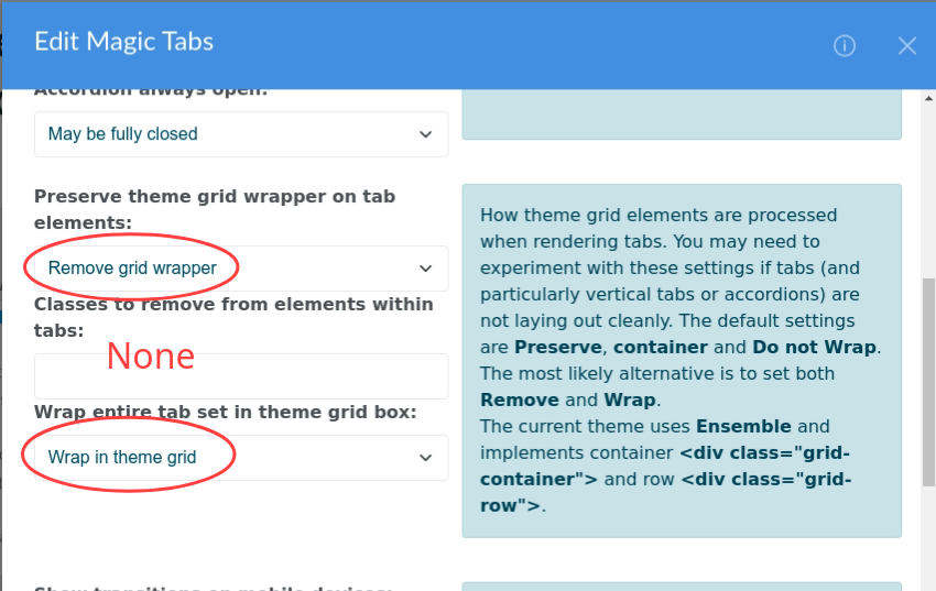
Modena theme
With the popularity of the Modena marketplace theme, from v9.0.4 Magic Tabs includes Tabs and vertical tabs templates for the Modena theme.
These templates should also work with other themes based on the Vidal Themes Ensemble framework.
In the Global section of the block edit dialogue, Modena usually works best with the theme grid options set to Remove, none and Wrap.
Avoiding CSS bleed
All Magic Tabs block templates view.php and view.css use a class name unique to the template to prefix all styles. This ensures that each template cannot unwittingly bleed styles into other templates.
For example, the self contained starter template prefixes all styles in the view.css with .jl_magic_tabs_self_contained_starter. In the view.php the proforma for the tabs assigns to the outermost <div> the class jl_magic_tabs_self_contained_starter so tying it to the classes in the css.
When you copy the self contained starter template to applications/blocks/jl_magic_tabs/.... to create your own template, you need to replace this class with your own class name that is unique to your template.
You can copy any of the supplied Magic Tabs templates to create your own templates. Once copied, you must edit your template to use a unique class name inside.
More details can be found in the comments inside the templates.