Image Backgrounds and Borders
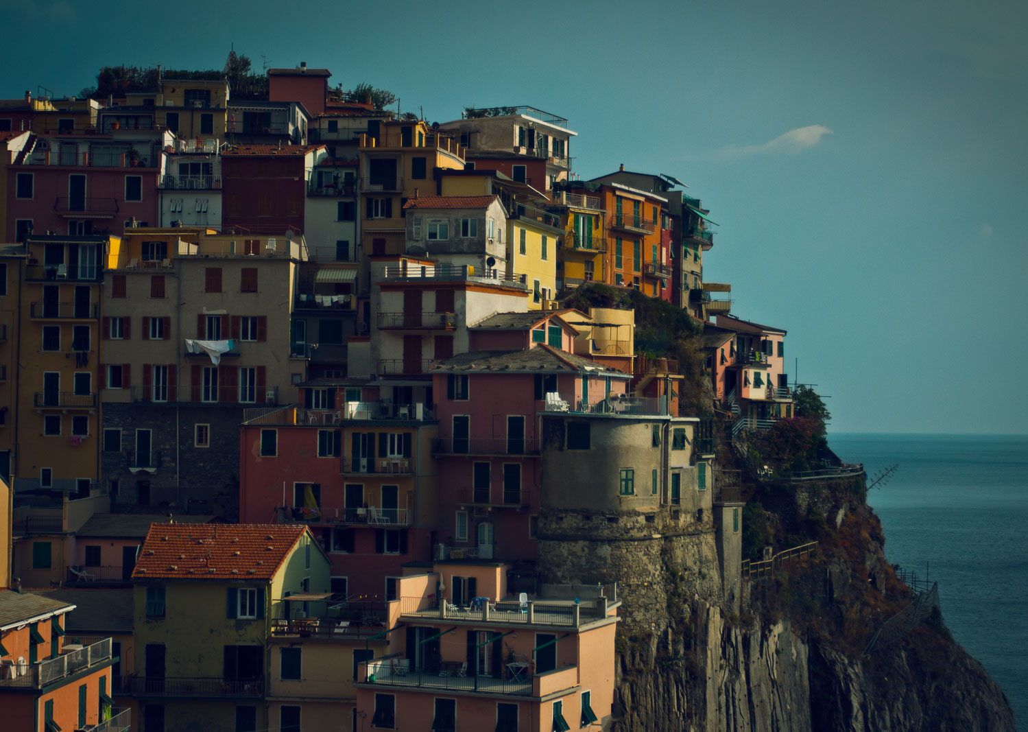
Many Onmi Gallery display widgets have a capability to design the background and border about the actual image. In the example above a Thumbnail Grid display widget has been configured to make an image look like it is framed to give an impression of a 35mm film silde. All information overlays and the ligntbox have been disabled to avaoid distraction. You can see all that stuff in action on other examples.
There are lots of other things you can do with backgrounds and borders and this is probably one of the more complex designs. By understanding how this works, you will get some ideas of the kind of formatting about images that can be easily achieved.
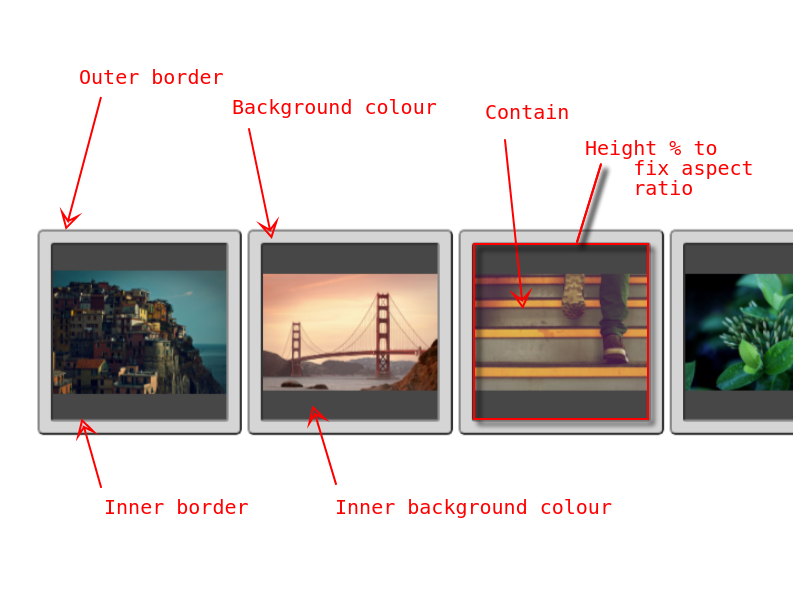
First, here is a screenshot showing what visible elements the various parameters are associated with.
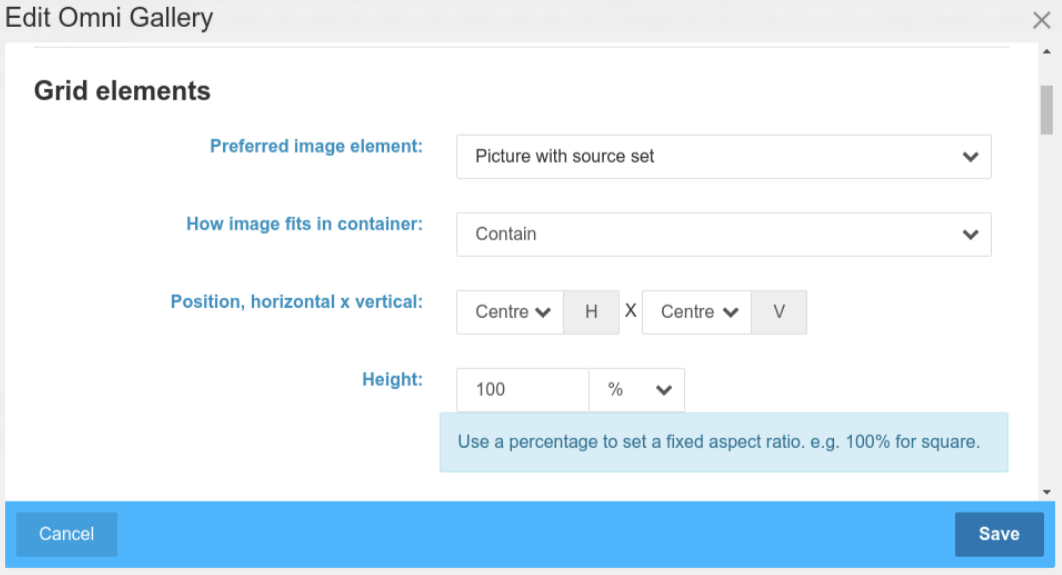
The preferred image element here is a <picture>, though it could just as easily be any of the other options. Select whatever works for your images, their dimensions and the thumbnails available.
More importantly, as we know the images differ in aspect ratio, the fitting into the container is set to 'contain' and position set to center. This ensures the image will be fitted into our slide like design without cropping.
To look good for images that will be both portrait and landscape orientation, we want a sqaure aspect ratio for the overall container, so height is set to 100% (the default install images are all landscape, but we are thinking beyond that).
The next section of the edit dialog is where the actual borders and backgrounds are designed.
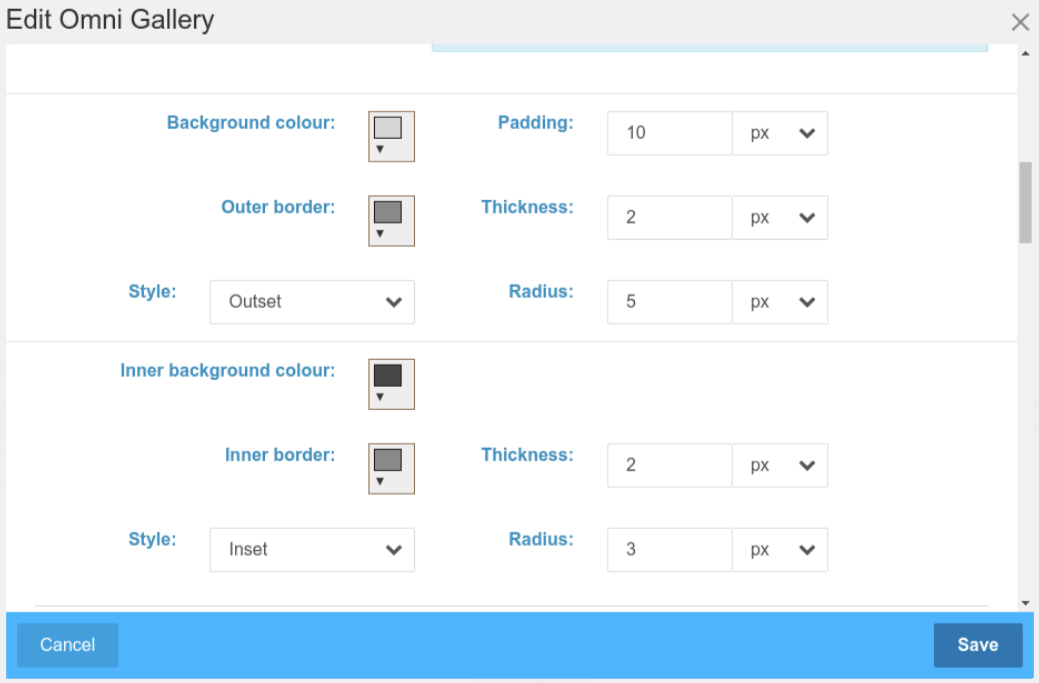
Compare the elements here with those marked in red in the first screenshot.
We have two elements to configure. The outer element is wrapping div and given a lighter grey background colour. The inner element is the actual picture element and is given a dark background colour. As the outer background surrounds the entire image proportinally, we can use it to create a frame that here is set to 10 pixels wide. The aspect ratio configured to 100% above refers to the outer wrapping element and makes the whole thing square.
Both the inner and outer borders are given the same mid-grey colour and outset/inset respectively. Outset and inset play a visual trick by varying the shade of the border colour slightly and look a bit more realistic with a little bit of border width - both 2 pixels in this case. Finally, both outer and inner elements are given a corner radius.
Other Widgets
We can implement similar with other display widgets. Here we have similar formatting applied to a Swiper display widget.
Going more retro
Purists may have noticed that this doesn't match exactly a 35mm slide. Real slides don't have a square inner window, they wrap the actual film and the frame tends to yellow a bit.
In the next example the outer and inner backgrounds have been set to the dirty cream-ish colour. If you look at the View Settings, the values are thicker and the units are now in % to make the thicker units scale with the display.
Unfortunately the inner border can't be used to inset about the image because it doesn't actually run along the edges of the image. To achieve that we would require an additional layer of wrapping element, to seperate the picture element from the inner wrapping, a complexity that hasn't been built into any of the current display widgets.
For a little more realism, the title has been written onto the frame. I used to do that to my own 35mm slides with a permanent marker pen. For ultimate realism, we would need a scralwed handwritten font here - but font selection is something for the theme, not for an Omni Gallery block.