Simple Examples of Display Widgets
As an overview of Omni Gallery's capabilities, this page shows how many of the display widgets can be used to show the same set of 6 images. Further example pages then go on to look at the finer details of some of the display widgets.
For all of these examples, the image title is taken straight from the file manager. The description is assembled from the description and image dimensions, again straight from the file manager. Any other file property or attribute or even embedded exif data could be selected. An optional link is the image URL, as required for a lightbox overlay. The text and background colours for all information and lightbox overlays is configured to white on an opaque grey.
The images in these examples are selected as a fileset. These could just as easily have been selected as a file manager folder or picked as individual images, or assembled from images associated with a User, Page or Community Store Product, or lists of those!
For these examples, all images link to a lightbox overlay. That is not compulsory. You can just as easily have no link, no overlay or even link to another page or URL taken from an image attribute.
All the examples below have a small View settings button to the top right, where you can view the block settings as JSON data and even copy them to paste into your own Omni Gallery blocks as a starting point. To import, use the Import button in the Support tab of the block edit dialog.
On this Page
Sliders and Carousels
Sliders show an image or group of images which progress through the overall set of images in response to user interaction such as Next and/or according to a timed show. As such, the difference between many of these display widgets and the reason for Omni Gallery providing so many options is the way the current image is presented and the variety of transitions available.
Glider
Glider is a simple and lightweight image slider, capable of displaying a single image or multiple images as a carousel. In this example it has been configured with the nice touch of responsive breakpoints so it toggles between showing 1 and 3 images depending on page width. As with pretty much anything in Omni Gallery, this is fully configurable. You can have any number of breakpoints showing different numbers of images.
The other capability this display widget introduces is a choice of how images are displayed. For displaying images you can choose any of:
- Picture element with responsive source set (as used in our examples)
- CSS background image
- Regular image element
- Image using resized thumbnail
Within each of those, image sizing and cropping can be any of:
- None - no resizing
- Cover - scaled and cropped to fill the available area (as used in our examples)
- Contain - scaled down to fit available width or height
- Fill - scaled by both width and height to fill without respect for the original aspect ratio
- Scale Down - as per contain, but never scaled up
Another general capability of many of Omni Gallery's display widgets is to set the height of the images. Any height unit can be used, with the advantage that when a %percentage is used, that fixes the aspect ratio. As all the images in the set used here are landscape, a fixed aspect ratio of 66% works well with a responsive page.
Swiper
Swiper is a more complex image slider, again capable of displaying a single image or multiple images as a carousel or an infinite carousel. We could have shown 3 images at a time, but that would have looked like Glider. In this example we have Swiper configured to show 1 image in an infinite carousel looping round our selected fileset. (We could also have done the opposite, and configured Glider to show 1 image at a time rather than 3).
Again the image element is selected as a full picture element and sized to cover the element to keep all images the same size. Such a slider can be further modified for a full width hero slider by disabling the theme grid wrapper in block design.
Swiper has some other neat display modes, so we will show it again with a different display modes below.
Swiper Effects
Our next example is again using Swiper, this time using the coverflow animation. The effects available are:
- Slide (shown above)
- Fade
- Cube
- Coverflow (shown below)
- Flip
- Cards
When considering an effect, you also need to think about the number of images. For example, fade can be a little bit weird with more than one image. Coverflow works best with 3 images, or at least with an odd number. There are so many variations possible that we have another example page dedicated to Swiper Variations.
Bootstrap Carousel
The Bootstrap Carousel display uses the Bootstrap Carousel component to display images and associated information. To use the Bootsrap Carousel display widget the site theme or page theme needs to be Bootstrap 5+ and to include the carousel component within the theme's build of Bootstrap.
This display uses bootstrap classes, so picks up styling from the Bootstrap theme for light or dark controls. On top of that we have the usual choice of image elements, two levels of Omni Gallery borders and padding, and information overlay. A further option is to use the Bootstrap caption classes instead of the information overlay.
Owl Carousel
The Owl Carousel display widget adapts Omni Gallery to use the Owl JavaScript widget. Owl is highly configurable touch compatible carousel and slider using CSS transitions.
As with other display widgets, you have full control of the image element used, how images are fitted to it and how they are loaded or lazy loaded.
The Owl GitHub project is no longer maintained, but Owl is a much liked slider and has been requested more than once. The Owl code is stable. So here it is.
Cycle2 Slider
The Cycle2 Slider display widget adapts Omni Gallery to use the Cycle2 JavaScript widget. Cycle2 is an older slider with some unique transition options. The Cycle2 GitHub project is no longer maintained, but it is stable.
As with other display widgets, you have full control of the image element used, how images are fitted to it and how they are loaded or lazy loaded. Swipe is enabled for touch compatible devices. Here we show a tile transition animation.
Vegas
The Vegas display widget creates a background image slider, placing a background behind everything on the page, or behind a specified element such as an area or block.
Here we have used Vegas to provide a background for the content block below.
Vegas
The Vegas display widget creates a background image slider, placing a background behind everything on the page, or behind a specified element such as an area or block.
Here we have used Vegas to provide a background for this content block!
To make the text visible over the background, a mask has been applied behind the text using a span with style attributes.
<span style="background-color:rgba(255,255,255,0.6);padding:2px;border-radius:2px;">Text</span>
Block design has been used to assign the class .omni-vegas2 to this content block and the Omni Gallery Vegas display widget configured to select on that class rather than the whole page. Block design has also been used to add a little padding and a minimum height.
While we have only applied Vegas to the background of a single content block here, a more typical application would be to apply it to an area or an entire page.
Big Scroll
Big Scroll displays a vertical list of images, usually with a fixed background attachment so the images change with the vertical scroll. The effect doesn't amount to much when used in line, but can be a great way of showing hero entry pages, so have a look at our separate Big Scroll Hero example.
Scroll down to see Big Scroll working with our usual set of images.
Galleries
Galleries show an arrangement of all the images at the same time, sometimes paginated or with an ajax extending list. The distinction between a slider and a gallery is not absolute. Some sliders have gallery like properties and some galleries could be configured with a page size of 1, so almost like a slider.
This is one of the beauties of Omni Gallery. You can assess many different ways of displaying images through the one addon and decide which suits best!
Thumbnail Grid
The Thumbnail Grid display widget provided by Omni Gallery is a fairly standard grid, but with all of the configuration of Omni Gallery available. The grid can be configured to show responsive numbers of images in a row depending on screen size.
As with other display widgets you have full control of the image element used, how images are fitted into it and how they are loaded or lazy loaded. In our example below we use a picture and cover again.
Whilst the information overlay with most previous display widgets is fixed, with the information overlay with the Thumbnail Grid display widget can be permanent or show on hover, with a range of animations available:
- Slide from left
- Slide from right (as used in our second example below)
- Slide down
- Slide up
- Fade in
- Flip image horizontal
- Flip image vertical
- Flip overlay horizontal
- Flip overlay vertical (as used below)
- Grow
- Spiral
Thumbnail Grid Variations
In addition to selecting the type of image element used, we also have control over 2 levels of wrapper and background. Here these have been used with the same Thumbnail Grid to wrap the images in frames that look a little like 35mm film slides. We also have changed the grid to be 6 in a row on large displays, with 3 on medium displays and 1 on small displays.
Its not just the Thumbnail Grid that provides this degree of control from the edit dialog. Many other display widgets have similar capabilities.
Massive Galleries
Thumbnail Grid is also a good choice to configure with pagination to show absolutely massive galleries.
Cards Grid
Many display requirements involve a grid of cards, where each card shows a thumbnail, some text and perhaps a link to elsewhere or to show details. This kind of display used to require an element with Omni Gallery Elements, but this was such a common usage that Omni Gallery now provides a Cards Grid image display. As you would expect with Omni Gallery, you can use it with any image source from images in the file manager to calendar events and lists of users, and display any properties and attributes of those sources. Its ideal for creating a staff portfolio sourced by listing users in a user group, a blog or projects list sourced from pages with thumbnail images, or an index to a store using Omni Gallery for Community Store.
Here we see the Cards Grid used to display our usual files and data.

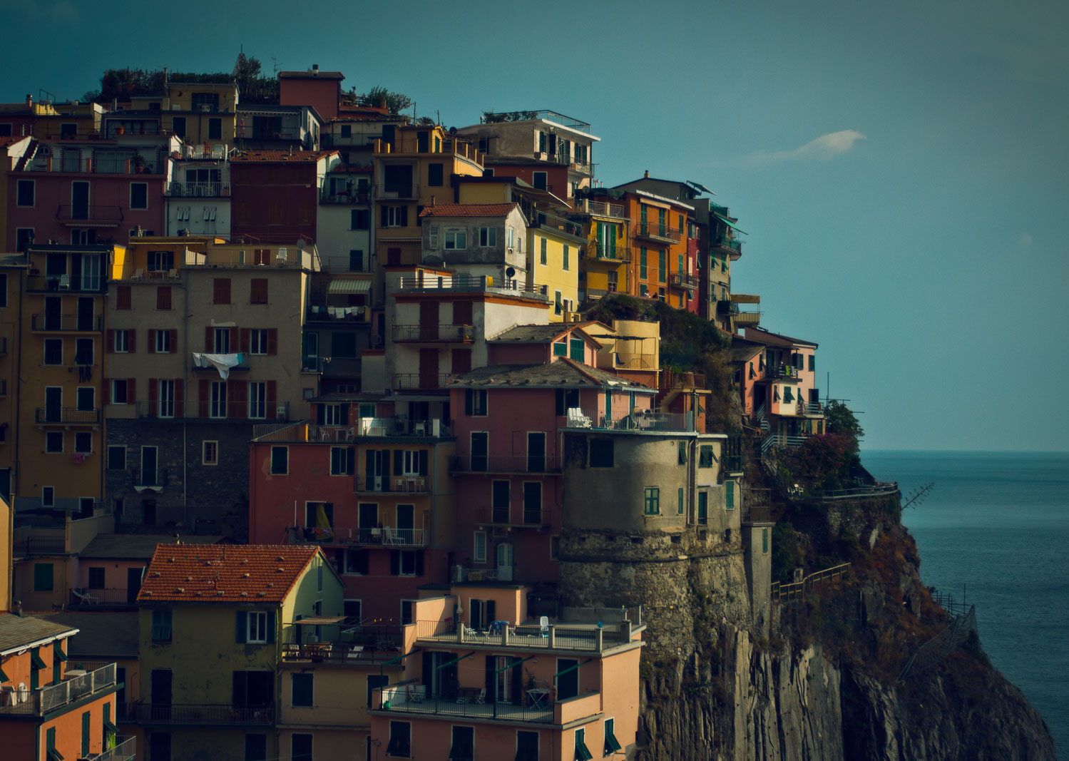
Houses

Bridge

Shoes

Plants

Subway

Sunset
Masonry
Masonry provides a tiled view of images of dissimilar sizes and aspect ratios using the classic Masonry javascript. In its purest form, this can result in many discontinuities in the tiled effect unless image sizes are carefully configured. To make it easier to achieve a good effect, the Omni Gallery implementation is based on common aspect ratios for portrait, landscape and square images. These ratios can be configured through the display widget options with images contained or covered within those sizes. Images are scaled to a common width across all aspect ratios.
Hero images are scaled up by a configurable percentage and identified by any or all of:
- a boolean file attribute is_featured,
- by random selection,
- by index (starting from 1).
In our example below images 1 and 6 are specified as hero images and doubled in size.
Core block templates
As well as third party display widgets, Omni Gallery can utilize block view templates from the Concrete CMS core Image Slider, Image Gallery and even from the Page List block!
Combine these with Omni Gallery's many image sources and you can make a page list look like a slider, a calendar look like a gallery and make a portfolio of images display to match a portfolio of projects.
Core Image Slider
The core image slider block fronts for a more capable slider implementation than the edit dialog from the core block would suggest. This display widget uses the block template from the core image slider to show images and properties selected by Omni Gallery with a few extra display options incorporated. You have complete control over the information overlay content and position. You are not limited to the core block's image picker. With Omni Gallery and this display widget you can use the same slider with filesets, folders or even system directories of images.
If you have alternate templates for the core image slider block, perhaps provided by your theme, you can select from them within this display widget.
You do need to be careful when preparing images for use with the core image slider. It requires a fixed aspect ratio and crops from top left, so can leave some images awkwardly cropped, like the bridge in this example. On a real site you need to uploaded images already cropped to fit your design with the core image slider.
For fun, the lightbox is also opened and closed with Omni Gallery's grow transition.
Whilst Omni Gallery can display images using the core image slider and enhances some of the core block's capabilities, there are limitations of how images are displayed and positioned built into the core slider. If you require a more flexible display consider the Swiper display widget.


Core Image Gallery
This Core Image Gallery display widget interfaces to the block view and templates for the Core Image Gallery block, but using images selected using Omni Gallery Image Selectors and provides greater flexibility for how the image information is displayed.
Because the Core Image Gallery uses core and theme provided templates, how it displays is very much theme dependent. It works best with Atomik and other Bootstrap 5 based themes. It will work OK with Elemental, but would be very much restricted by Elemental not supplying a theme specific template and so falling back on the core default template.
Core Page List
While on the subject of core blocks, our next display widget for Omni Gallery uses templates from the core page list block. The main page list view template is not very interesting. If you are on the Elemental theme the alternate thumbnail grid template is a nice overview for a gallery when used with a lightbox and many themes provide further image-based page list templates you can use with Omni Gallery.
You can use any page list template to display images without needing to list any pages! Omni Gallery image selectors are used to select images, these images are then injected into the page list template.
If you want to take this further, you could add page select attributes to the files and use those to link to other pages - a fileset or file folder could become a navigation element!
For fun, the lightbox is also opened and closed with a spiral transition.
A useful diagnostic for image selectors
Information List
The Information List display widget is a simple text/list dump of the images that would be shown in the Omni Gallery (so its not really a gallery or slider). It can come in useful as a diagnostic when working with Image Selectors - use it to see what will be in a gallery or slider without getting distracted with how it is displayed, then swap to the real display widget once you have the list worked out.
-
Houses
https://c5magic.co.uk/application/files/1215/2787/3630/houses.jpgHouses on a hillside.
1499px x 1067px -
Bridge
https://c5magic.co.uk/application/files/6115/2787/3631/bridge.jpgThe iconic Golden Gate.
1600px x 1067px -
Shoes
https://c5magic.co.uk/application/files/4615/2787/3632/shoes.jpgIn these shoes? Kirsty MacColl would have approved.
1600px x 1067px -
Plants
https://c5magic.co.uk/application/files/1234/1234/5678/plants.jpgIn amongst the bushes.
1600px x 1066px -
Subway
https://c5magic.co.uk/application/files/9315/2787/3632/subway.jpgIn London its the Underground or the Tube. In Europe it is the Metro.
1600px x 1067px -
Sunset
https://c5magic.co.uk/application/files/4715/2787/3633/sunset.jpgSunset in the city.
1600px x 953px