Chart Design
Colour Palettes for Charts
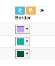
Colour schemes for charts can involve long lists of colours. To make that easier to manage, we have some special extensions to the standard Concrete CMS colour picker.
In most cases, colour palettes and point styles can be applied by
- Row - Each row uses the next line of the colour palette or point style. All columns in a row are styled the same. You can see this in use in most of our basic examples.
- Column - Each column uses the next line of the colour palette or point style. All rows are styled the same
- Row and Column - Styles are used sequentially though rows and columns. You can see this in action in the basic example doughnut chart.
In all cases, when we get to the end of a list of styles or colours, we start again from the beginning.
Manage entire columns of colours
Effective charts need nicely designed palettes of colours to help convey their information. UCP Charts supports configuring colours individually and by paste / import of lists of colours.
In additions to designing and inputting colours individually, each colour list in UCP Charts also provides a toolbar to help manage the colour list as a whole. As a starting point, you can make a list from your corporate design palette or use an online palette generating tool such as one of the tools listed below. Then copy your list of colours and in the chart edit tab use the column paste control to import the list to the chart.
The import processing can parse and extract colours from pretty much any export format from the online tools including fragments of HTML, SVG, CSS, LESS, SASS or just a plain text list of #hex codes, rgb, rgba or hsl values. Hey presto - a pre-designed list of colours in your chart.
The colour column tools also provide an export / copy tool to copy between columns and a bulk transparency and lightness/darkness tool to quickly adjust transparency and lightness/darkness for an entire column of colours. A typical use is to import a palette of line or border colours, then copy that list to the fill colour and add some transparency and/or lighten the fill colours.
Internally, the export / copy tool manages a current list of colours in browser storage and pre-populates the import / paste dialog and the colour picker palette. Having imported and perfected a charting colour scheme, you can then easily copy and reuse the colours between charts and between sites.
Global sort and shuffle
Our other global control is . This opens a sub menu for global sorting and shuffling the rows of colours. Unlike the individual column toolbars, these tools operate on entire rows of colours, so keeping fill and outline colours together.
random - Random shuffle of the rows of colours. Use with caution as randomization is a one-way process.
reverse - Reverse the rows of colours. Reverse again to return to the original sequence
Row controls
The remaining controls operate on individual rows of colour to add, remove and sort by drag and drop.
- Delete row.
- Add row, copying colours from current row or last row.
- Drag row up/down to sort.
Some useful colour palette resources
These resources have all been tested to create palettes of colour that can be imported by UCP Charts. The colours from these resources can be text copied using the cursor on their text values, or exported and the exported text copied. As already noted, the import processing of UCP Charts can parse and extract colours from pretty much any export format you can extract from these tools.
- https://gka.github.io/palettes
- https://paletton.com/
- https://coolors.co/
- http://colormind.io/
- https://mycolor.space/
- https://www.canva.com/
- https://paletton.com/
- https://colors.muz.li/
- https://meyerweb.com/eric/tools/color-blend
- https://www.w3schools.com/colors/colors_picker.asp
- https://color.adobe.com/create/color-wheel
- http://www.colourlovers.com/
- https://colorhunt.co/
- https://javier.xyz/cohesive-colors/
- https://www.colorcombos.com/combotester.html
- http://colorhunter.com/
- https://htmlcolorcodes.com/
Fonts for Charts
Charts 'inherit' their fonts from the page theme and how it styles the enclosing area and block design. If you require different font sizes, faces or colours, set them in block or area design and the chart will follow.
The chart will use the same design for all fonts within the chart, save that smaller text is 70% the size of the larger text.
Data Labels and Tooltips
Settings for Data Labels and Tooltips can be found in the legend section of the edit dialogue. Labels are shown over the chart data. Tips are shown when a section of the chart is hovered. In general, they format the column and row values and show them.
Getting labels and tooltips right can take a bit of experimentation. Start with none or the default option. Beyond that it is hard to generalize because the different charts within UCP Charts are a little inconsistent and rules unto themselves.
Label / Toolstip Masks
If you find a label or tip includes value information you don't want to show, you can mask it out by setting a label mask.
A label mask is a string of "T" and "F" characters that are used to show (T) or hide (F) the values available for the label. For example, a mask FT will show only keep the second part. You just need to experiment.
Format Strings
If you can't get what you want easily from the available options, you can achieve pretty much anything by selecting Format with Placeholders. This allows configuring a format string where {xx} placeholders are replaced with available information about the point on the chart. The placeholders you can use are:
- {rh} - Row heading
- {ch} - Column heading
- {v1} - First value, usually the row value
- {v2} - Second value, usually the column value
- {v3} - Third value, typically the radius value for a bubble chart
Availability and value of these placeholders varies between chart types and between data labels and tooltips. (Again I am afraid there is little consistency). The easy solution is to experiment by configuring a format string like "R:{rh} C:{ch} V1:{v1} V2:{v2} V3:{v3}". This will show everything that is available and you can then decide what format to actually use. The {v#} placeholders also relate to the TTT mask sequence in the label mask above.
For example, if your column values are prices, you could use a format string like "${v2}". If your column values are percentages, then "{v2}%".
Chart key
The Chart From Table content display provides some options to enable automated generation of a key within the chart canvas. When this is selected, a best guess of what key you need is made from the data and chart type and colour swatches generated with the key item labels.
Within the Chart From Table content display the only control you have is which side of the chart the key is positioned on, what sequence it is in, or which items appear in the key.
To provide a much more flexible key generation, we have an associated Chart Key From Table content display. By disabling the key that would be auto-generated with the chart and Using a second Universal Content Puller block, Chart Key From Table can be set up with the same source data as the chart and configured to generate the key you require.
Chart Key From Table also attaches marker classes to each item and has an option to skip outputting the generated key styles. With that in mind, you can also use your own CSS to augment the key styles or to completely take over the key styling.