Getting started with charts
To create a good looking chart from your own data, you need both a good understanding of how that data can be pulled and displayed as a table and how that table translates into a chart.
That is a lot to grasp in one big jump. Hence we advocate starting from two directions simultaneously. Add two UCP blocks to the page and understand the process from both directions.
You don't need to keep both, just whichever one you reach the other end of configuring first!
Our first example here is just the year 1958 from our now familiar example CSV source and the Chart From Table display.
The key is generated from another UCP block with a Chart Key From Table display using the same data but no row (year) headings.
Begin with a Table
Before you can create a chart, you need some tabular data to work with. With that in mind, one way to begin is by using your selected Content Source and Content Transform with the Table Content Display to view your data. Adjust the transforms and display settings to filter it to the rows and columns you want to show until you have just the data you want to chart showing in a table.
You will see that approach in the charts examples in this site. We show the table first, then the chart using the same data. There is no requirement to keep the table, it is just a working step. We just show it to help you visualize the overall process.
Make frequent use of the Preview button to review the incoming data to the transform and display.
Then change the content display selected to Chart from Table and edit the chart settings.
| Jan | Feb | Mar | Apr | May | Jun | Jul | Aug | Sep | Oct | Nov | Dec | |
|---|---|---|---|---|---|---|---|---|---|---|---|---|
| 1958 | 340 | 318 | 362 | 348 | 363 | 435 | 491 | 505 | 404 | 359 | 310 | 337 |
| 1959 | 360 | 342 | 406 | 396 | 420 | 472 | 548 | 559 | 463 | 407 | 362 | 405 |
| 1960 | 417 | 391 | 419 | 461 | 472 | 535 | 622 | 606 | 508 | 461 | 390 | 432 |
Begin with a Chart
This is the other way to get started with creating a chart of your own data.
Find a chart close to what you want amongst the examples here then use View settings to copy the JSON and then Import it into a UCP block on your own site.
You can now study the chart settings used and adjust the Content Source and Content Transform to pull the content you desire into this chart. The key here is automatically generated with the chart.
As with the Begin with a Table approach, make frequent use of the Preview button to review the incoming data to the transform and display.
Chart Settings
If you have already used the UCP block to display a Table, the table data settings will be repeated in the section Data further down the edit dialog for Chart from Table. Scroll ahead to have a quick look, the return to the top.
Various sections and items in the edit dialog show/hide depending on the chart type.
Chart type
Chart type where you select the type of chart to translate the table of data into. You can select between many chart types and variations within those types, both for how charts display the data (filled, stacked) and how they extract the data from a table.
- Pie
- Doughnut
- Radar
- Polar area
- Bar
- Line
- Scatter
- Bubble
The basic chart types generally plot column headings against each row in turn.
Many of the chart types are also provided suffixed +X+Y rows or X+Y+R rows, indicating the data is taken from pairs or triplets of rows and any column heading may be used to label data, but is not plotted.
Another variation is where chart types note colum heading +Y rows or row1 +Y rows. In that case the data is taken from the respective headings or specified rows followed by repeated Y and/or R from the following rows.
Canvas
Charts are plotted into an HTML canvas element with a fixed aspect ratio. You set the width of the chart as a percentage of the area width and its height as a percentage of the width to give the aspect ratio. To go with that you can add a bit of padding if parts of the chart get too close to the edge of the canvas.
The responsive width and responsive height can be used to change the aspect ration when a chart is plotted into a portrait layout device smaller than the responsive width.
Tension applies bezier curve smoothing to any line charts. Not this is curving for pleasing visual effect, not a mathematical curve fit.
Finally we have the grid that is shown behind the chart. This is best left empty and alone unless you want a different line colour or line width to the default.
Styles from block design are also propagated to the canvas, so you can use block design to add margin, padding, background and font styling.
Legend
Is all about adding a key, axis labels and information over the chart.
The Chart From Table content display provides some options to enable automated generation of a key within the chart canvas. Where the auto-generated key doesn't deliver what you want, the Chart Key From Table content display can be set up with the same source data and configured to generate any key you require.
Data Labels and Tooltips
The legend that needs further explanation is Data Labels and Tooltips. Labels are shown over the chart data. Tips are shown when a section of the chart is hovered. In general, they format the column and row values and show them. Start with none or the default option.
Beyond that it is hard to generalize because the different charts within UCP Charts are a little inconsistent and rules unto themselves.
Label / Toolstip Masks
If you find a label or tip includes information you don't want to show, you can mask it out by setting a label mask.
A label mask is a string of "T" and "F" characters that are used to show (T) or hide (F) the values available for the label. For example, a mask FT will show only keep the second part. You just need to experiment.
Format Strings
If you can't get what you want easily from the available options, you can achieve pretty much anything by selecting Format with Placeholders. This allows entry of a string where {xx} placeholders are replaced with available information about the point on the chart. The placeholders you can use are:
- {rh} - Row heading
- {ch} - Column heading
- {v1} - First value, usually the row value
- {v2} - Second value, usually the column value
- {v3} - Third value, typically the radius value for a bubble chart
Availability and value of these placeholders varies between chart types and between data labels and tooltips. (I am afraid there is little consistency). The easy solution is to experiment by configuring a format string like "R:{rh} C:{ch} V1:{v1} V2:{v2} V3:{v3}". This will show everything that is available and you can then decide what format to actually use. The {v#} placeholders also relate to the TTT mask sequence in the label mask above.
For example, if your column values are prices, you could use a format string like "${v2}". If your column values are percentages, then "{v2}%".
Data
The Data section is how the table of data is extracted from the transformed data. This works in exactly the same way as the Table data display. Hence the advice above to begin with a table. You will usually want to define headings for the Rows and Columns, then filter those rows and columns from display because the chart will be using them for the axes.
Bars, lines and areas
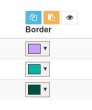
The main control here is an extendable list of colours for lines and how they are filled. As designing a colour scheme for a chart is such a big thing we have a dedicated page going into the details of Colour Palettes for Charts. As well as colours, we have options for border width and radius.
For most chart types, this palette of colours can be applied by Row, by Column or Row and Column. The colour palette is cycled through as the row or column changes. Or if you have a long enough palette, the cycle can spread across multiple rows and columns.
Points
The edit dialog for points starts off similar to that for bars and lines above, so we refer to Colour Palettes for Charts again. We also have options for border width and radius and whether this palette of colours can be applied by Row, Column or Row and Column.
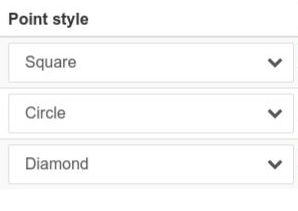
Points don't have to be just circles. They can also be styled by selecting a shape such as squares, diamonds, stars and more, which in turn can also be applied by Row, by Column or Row and Column.
Axis and Scales
For the row and column axes, scales can be disabled, shown, or shown with an offset. Offset comes in useful when the axis would otherwise cut off a point or half of a bar.
Having enabled a scale, it is usually best to begin by leaving everything else 'auto'. That way you can see what it looks like and only need to make further changes where necessary.
With the scale left auto, the chart will make a guess where to start the scale. Alternatively, for numeric scales you can set a minimum value.
If automatic is not getting the scale as you need it, the scale position can be set to top/left or bottom/right. Scale type can be set to category, linear, logarithmic or time and forward or reverse.
The Learning Curve
The learning curve is not a chart! It is a metaphor for the process of learning how to use this powerful and complex display plugin for Universal Content Puller.
Before starting with your own charts, we strongly suggest you use a development site to explore some of the examples provided here. Work through the examples here using View settings to copy the JSON and then Import it into a UCP block on a development site.
Then learn how the settings work by changing just one or two settings at a time. There are a lot of tricks about selecting column and row headings, filtering columns and rows, transposing data and picking the right setting to get familiar with.